5 Easy Ways to Design More Neurodivergent-Friendly
5 Easy Ways to Design More Neurodivergent-Friendly
Author:
Stephanie Mazza
Insight
Have you ever wondered how neurodivergence impacts marketing? First, you need to understand what neurodivergence is, and how it affects the way people interact with your content.
Neurodivergence, defined
Neurodivergence is a way to describe people whose brains process, learn or experience the world differently than what’s considered neurotypical or “normal.” While the term "neurodivergence" is not a medical diagnosis, it describes a group of people who share certain brain differences and includes several conditions, including autism, ADHD and dyslexia. About 1 in 5 people are estimated to be neurodivergent.
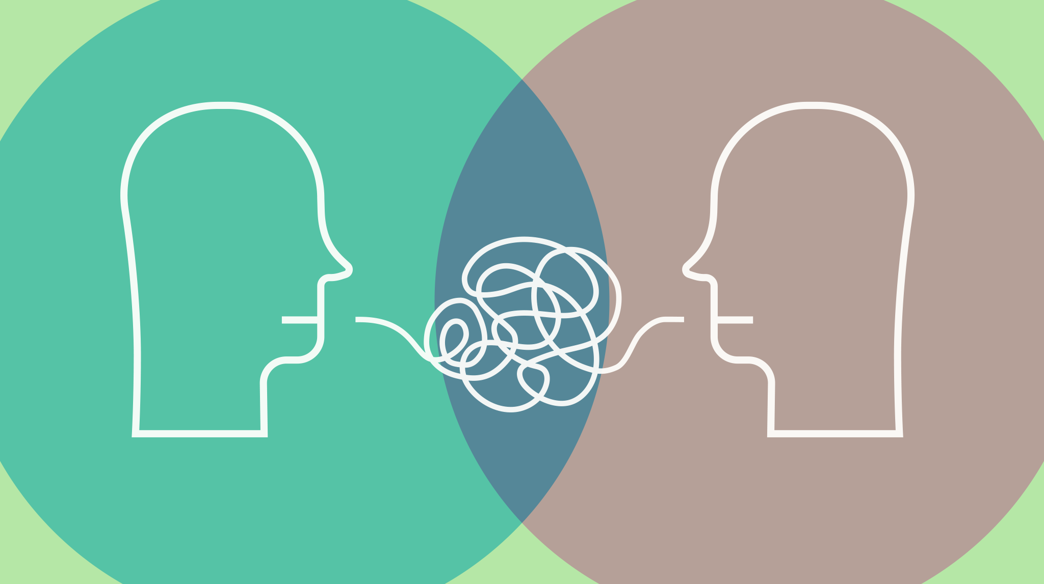
Here’s a simple example that can help illustrate how many neurodivergent people might experience and process information:
Imagine trying to have a conversation while someone is flicking the lights on and off, music is playing in the background and five people are talking at once. Now, try to focus on just one of those voices and remember what they said.
For many neurodivergent individuals, especially those with ADHD, autism or sensory processing differences, this is what a cluttered, fast-moving website or unclear content can feel like. It’s not a question of capability—it’s recognizing that environmental factors affect focus and processing. Design can’t change how someone’s brain works, but it can make the experience a whole lot easier.
Creating Neurodivergent-Friendly Content
Whether it’s your website, printed collateral, social posts or email newsletter, accessible design benefits everyone. By making things easier for people with disabilities, you’re improving the experience for all users. Here are five easy ways to make your content more accessible.
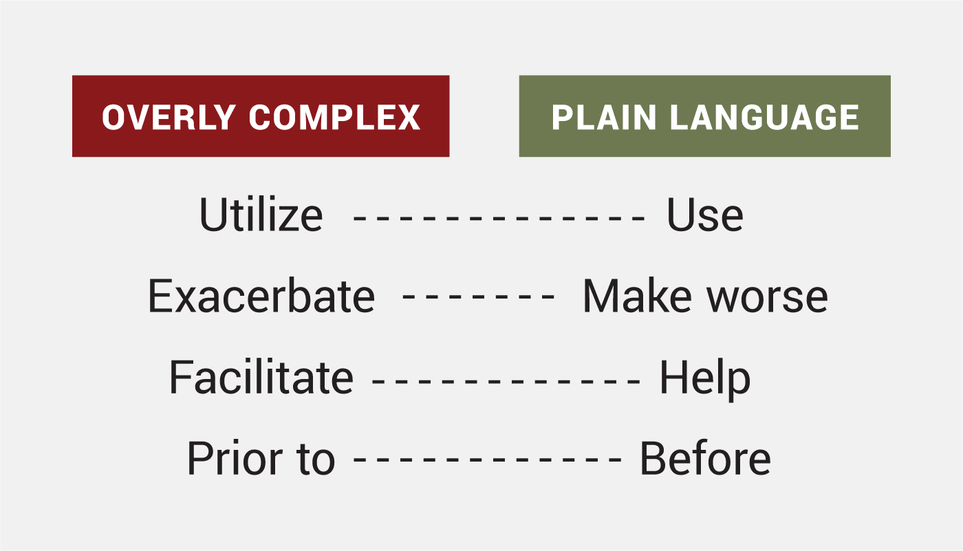
1. Plain language
Instead of using jargony words like "utilize" or "leverage," opt for simpler words like "use" and "help." Plain language won’t dumb down your content—it makes it more clear. If you wouldn’t say it in an everyday conversation, it’s probably not plain language.
Tools: Check out best practices on PlainLanguage.gov. You can also use ChatGPT to check text for clarity and reading level, as well as Hemingway Editor to simplify complicated, jargon-filled text and improve readability.
Complex Language: "We will provide a detailed analysis of your submission after a comprehensive evaluation of all the documents."
Plain Language: "We will review your submission and get back to you soon.”
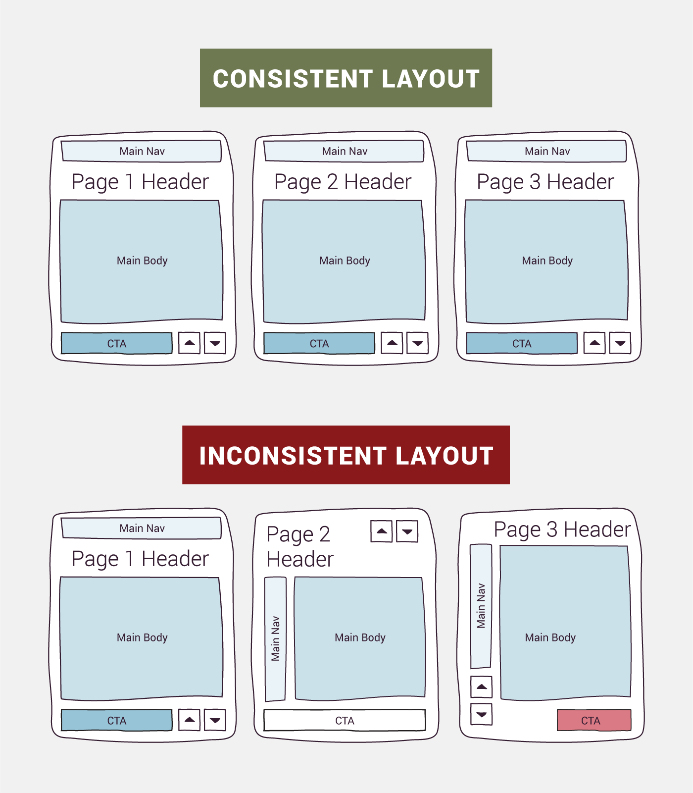
2. Consistent layouts
Keep your layout predictable (but not boring!) and consistent. For websites, this means keeping navigation in the same place on each page, using universal symbols for icons and ensuring buttons have consistent shapes and colors across pages.
Tip: If you know your site could use some TLC (or even an extreme makeover), now’s the perfect time to incorporate accessibility best practices into your plans. Accessible design improves user experience for everyone, whether they’re on their phone, outside in the sun or dealing with spotty service. And if you need your site to be 508 compliant, we can help with that too.
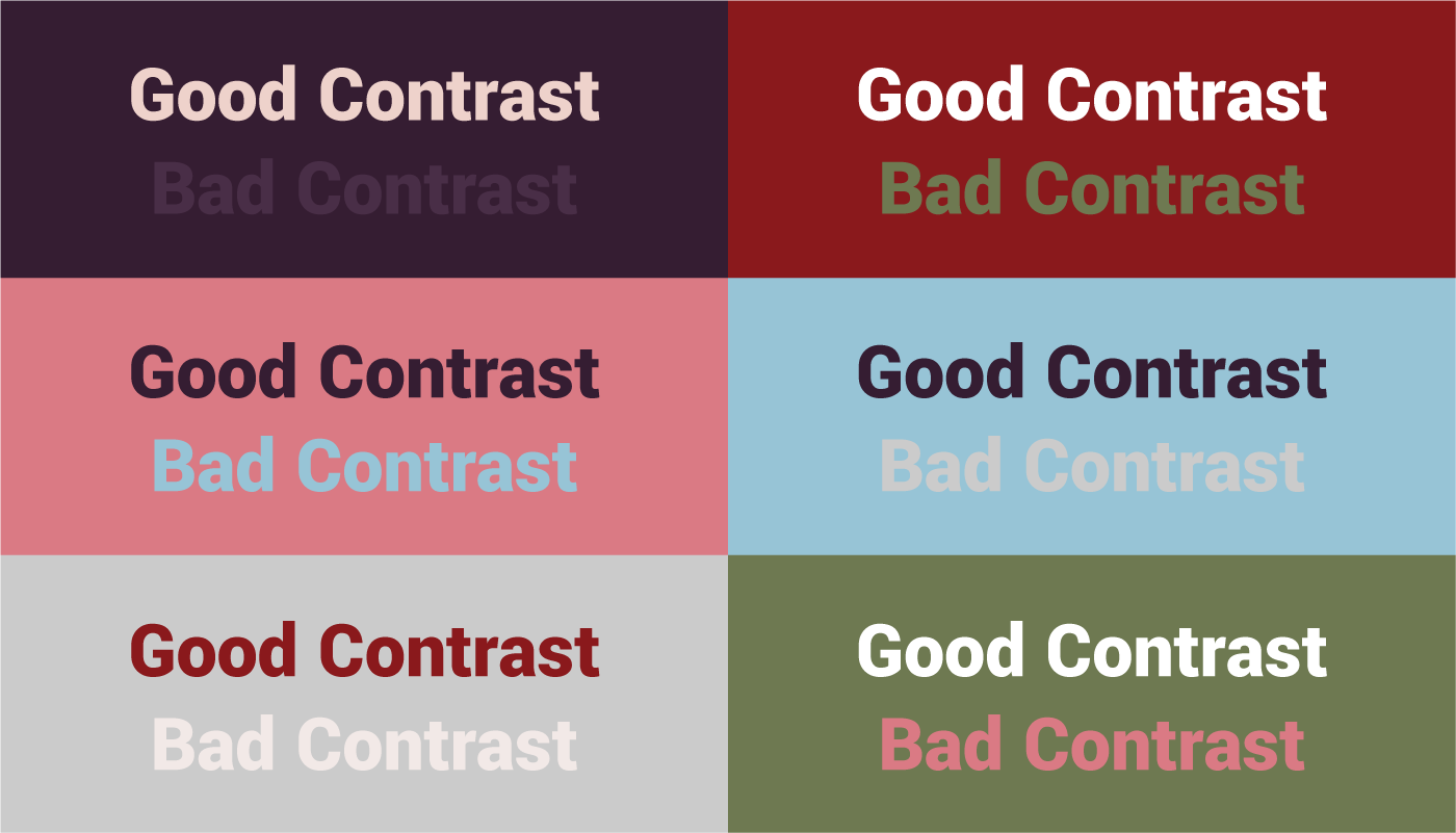
3. Color contrast
For both printed and digital content, make sure text stands out clearly against the background, whether it’s dark text on a light background or light text on a dark one. Good contrast helps users with dyslexia, ADHD and autism better process information and navigate your site without strain.
Tools: Simple but mighty, the WebAIM Contrast Checker is the OG and beloved for a reason. And if you need a quick test with no hex codes required, head outdoors into bright light and dim your screen. If you struggle to read the text, you should adjust color contrast.
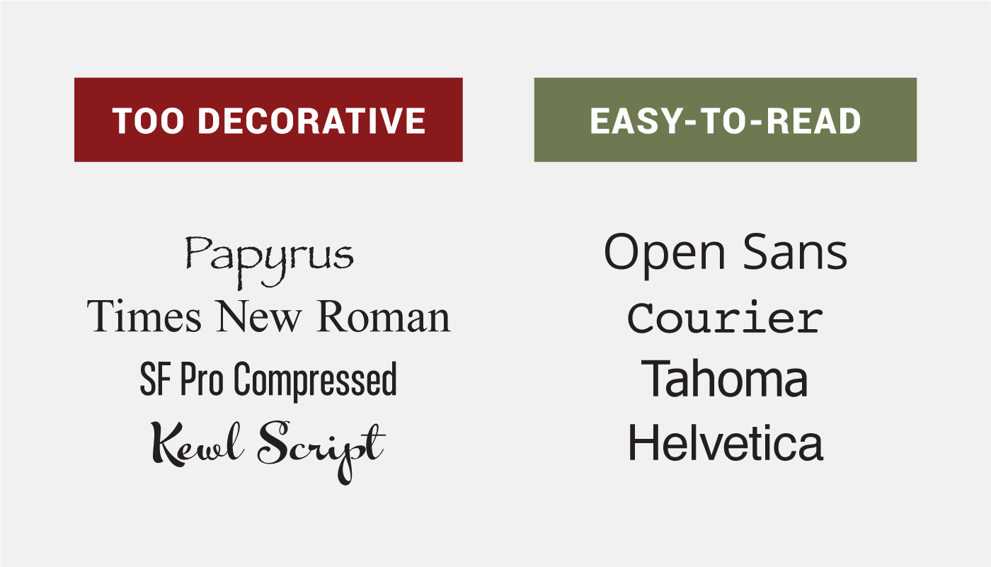
4. Clear typography
When you ask readers to absorb a lot of information, use easy-to-read fonts like Arial or Helvetica, as their letters have more distinct shapes. Avoid overly decorative fonts, like cursive or ones with thin, condensed letterforms for body text. These fonts can be hard for anyone to read, especially those with dyslexia. Creative fonts can still have their place in design—just make sure the content that needs to be absorbed is clear and easy to read. Also, ensure text is large enough to read comfortably without straining the eyes.
Tools: As type choice can be a subjective (and touchy) decision, we’ll direct you to a designer-facing accessibility resource. The A11y Project’s This Week in Accessibility email newsletter is a great place to learn more about current and evolving accessible design best practices.
5. Avoid sensory overload
Who doesn’t love an intrusive animation or blaring audio when they first open a website? These elements can be distracting or overwhelming, especially to neurodivergent users. While we’d never tell you to stop being creative, it's important to give users the option to pause sound and moving images.
Tip: Provide an easy-to-find mute or pause button for any audio or animation on your website. This small change can help all users feel more in control of their experience.
Excited about accessible design? Us, too. Download our free guide to learn more about accessible design best practices. If you have specific questions, feel free to reach out.
SHARE
Get Updates
Sign up to get the latest updates on the Estiponies, industry news and what not. We promise to be responsible with your information and not sell it off to the dark web.